04.Flutter容器类组件
容器类 Widget 和布局类 Widget 都作用于其子 Widget,不同的是:
- 布局类 Widget 一般都需要接收一个 widget 数组(children),他们直接或间接继承自(或包含)MultiChildRenderObjectWidget ;而容器类 Widget 一般只需要接收一个子 Widget(child),他们直接或间接继承自(或包含)SingleChildRenderObjectWidget。
- 布局类 Widget 是按照一定的排列方式来对其子 Widget 进行排列;而容器类 Widget 一般只是包装其子 Widget,对其添加一些修饰(补白或背景色等)、变换 (旋转或剪裁等)、或限制 (大小等)。
Padding 填充
Padding 可以给其子节点添加填充(留白),和边距效果类似。Padding 定义:
Padding({
  // ...
  EdgeInsetsGeometry padding,
  Widget child,
})
EdgeInsetsGeometry是一个抽象类,开发中,我们一般都使用EdgeInsets类,它是 EdgeInsetsGeometry 的一个子类,定义了一些设置填充的便捷方法
EdgeInsets
fromLTRB(double left, double top, double right, double bottom):分别指定四个方向的填充。all(double value): 所有方向均使用相同数值的填充。only({left, top, right ,bottom }):可以设置具体某个方向的填充 (可以同时指定多个方向)。symmetric({ vertical, horizontal }):用于设置对称方向的填充,vertical 指 top 和 bottom,horizontal 指 left 和 right
示例:
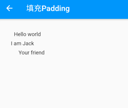
Padding(
    //上下左右各添加16像素补白
    padding: EdgeInsets.all(16),
    child: Column(
      //显式指定对齐方式为左对齐,排除对齐干扰
      crossAxisAlignment: CrossAxisAlignment.start,
      mainAxisSize: MainAxisSize.min,
      children: <Widget>[
        Padding(
          //左边添加8像素补白
          padding: EdgeInsets.only(left: 8),
          child: Text("Hello world"),
        ),
        Padding(
          //上下各添加8像素补白
          padding: EdgeInsets.symmetric(vertical: 8),
          child: Text("I am Jack"),
        ),
        Padding(
          // 分别指定四个方向的补白
          padding: EdgeInsets.fromLTRB(20, 0, 20, 20),
          child: Text("Your friend"),
        )
      ],
    ),
  );
DecoratedBox 装饰
DecoratedBox 可以在其子组件绘制前 (或后) 绘制一些装饰(Decoration),如背景、边框、渐变等。DecoratedBox 定义如下:
const DecoratedBox({
  Decoration decoration,
  DecorationPosition position = DecorationPosition.background,
  Widget? child
}
- decoration:代表将要绘制的装饰,它的类型为 Decoration。Decoration 是一个抽象类,它定义了一个接口 createBoxPainter(),子类的主要职责是需要通过实现它来创建一个画笔,该画笔用于绘制装饰。
- position:此属性决定在哪里绘制 Decoration,它接收 DecorationPosition 的枚举类型,该枚举类有两个值:
- background:在子组件之后绘制,即背景装饰。
- foreground:在子组件之上绘制,即前景
通常会直接使用 BoxDecoration 类,它是一个 Decoration 的子类,实现了常用的装饰元素的绘制
BoxDecoration({
  Color color, //颜色
  DecorationImage image,//图片
  BoxBorder border, //边框
  BorderRadiusGeometry borderRadius, //圆角
  List<BoxShadow> boxShadow, //阴影,可以指定多个
  Gradient gradient, //渐变
  BlendMode backgroundBlendMode, //背景混合模式
  BoxShape shape = BoxShape.rectangle, //形状
})
示例:
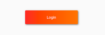
 DecoratedBox(
   decoration: BoxDecoration(
     gradient: LinearGradient(colors:[Colors.red,Colors.orange.shade700]), //背景渐变
     borderRadius: BorderRadius.circular(3.0), //3像素圆角
     boxShadow: [ //阴影
       BoxShadow(
         color:Colors.black54,
         offset: Offset(2.0,2.0),
         blurRadius: 4.0
       )
     ]
   ),
  child: Padding(
    padding: EdgeInsets.symmetric(horizontal: 80.0, vertical: 18.0),
    child: Text("Login", style: TextStyle(color: Colors.white),),
  )
)
Transform 变换
Transform 可以在其子组件绘制时对其应用一些矩阵变换来实现一些特效。
Matrix4
Matrix4 是一个 4D 矩阵,通过它我们可以实现各种矩阵操作,下面是一个例子:
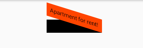
Container(
  color: Colors.black,
  child: Transform(
    alignment: Alignment.topRight, //相对于坐标系原点的对齐方式
    transform: Matrix4.skewY(0.3), //沿Y轴倾斜0.3弧度
    child: Container(
      padding: const EdgeInsets.all(8.0),
      color: Colors.deepOrange,
      child: const Text('Apartment for rent!'),
    ),
  ),
)
平移
Transform.translate 接收一个 offset 参数,可以在绘制时沿 x、y 轴对子组件平移指定的距离。
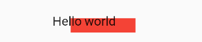
DecoratedBox(
  decoration:BoxDecoration(color: Colors.red),
  //默认原点为左上角,左移20像素,向上平移5像素
  child: Transform.translate(
    offset: Offset(-20.0, -5.0),
    child: Text("Hello world"),
  ),
)
旋转
Transform.rotate 可以对子组件进行旋转变换:
DecoratedBox(
  decoration:BoxDecoration(color: Colors.red),
  child: Transform.rotate(
    //旋转90度
    angle: pi/2 ,
    child: Text("Hello world"),
  ),
)
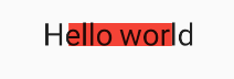
缩放
Transform.scale 可以对子组件进行缩小或放大
DecoratedBox(
  decoration:BoxDecoration(color: Colors.red),
  child: Transform.scale(
    scale: 1.5, //放大到1.5倍
    child: Text("Hello world")
  )
);
Transform 注意事项
- Transform 的变换是应用在绘制阶段,而并不是应用在布局 (layout) 阶段,所以无论对子组件应用何种变化,其占用空间的大小和在屏幕上的位置都是固定不变的,因为这些是在布局阶段就确定的。
示例说明:
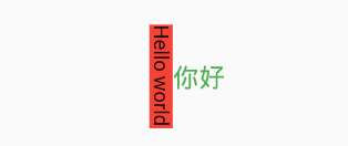
 Row(
  mainAxisAlignment: MainAxisAlignment.center,
  children: <Widget>[
    DecoratedBox(
      decoration:BoxDecoration(color: Colors.red),
      child: Transform.scale(scale: 1.5,
          child: Text("Hello world")
      )
    ),
    Text("你好", style: TextStyle(color: Colors.green, fontSize: 18.0),)
  ],
)
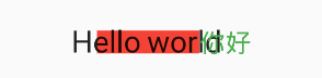
由于第一个 Text 应用变换 (放大) 后,其在绘制时会放大,但其占用的空间依然为红色部分,所以第二个 Text 会紧挨着红色部分,最终就会出现文字重合。
- 由于矩阵变化只会作用在绘制阶段,所以在某些场景下,在 UI 需要变化时,可以直接通过矩阵变化来达到视觉上的 UI 改变,而不需要去重新触发 build 流程,这样会节省 layout 的开销,所以性能会比较好。如之前介绍的 Flow 组件,它内部就是用矩阵变换来更新 UI,除此之外,Flutter 的动画组件中也大量使用了 Transform 以提高性能。
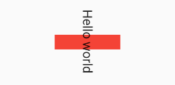
RotatedBox
RotatedBox 和 Transform.rotate 功能相似,它们都可以对子组件进行旋转变换,但是有一点不同:RotatedBox 的变换是在 layout 阶段,会影响在子组件的位置和大小。
示例:
Row(
  mainAxisAlignment: MainAxisAlignment.center,
  children: <Widget>[
    DecoratedBox(
      decoration: BoxDecoration(color: Colors.red),
      //将Transform.rotate换成RotatedBox
      child: RotatedBox(
        quarterTurns: 1, //旋转90度(1/4圈)
        child: Text("Hello world"),
      ),
    ),
    Text("你好", style: TextStyle(color: Colors.green, fontSize: 18.0),)
  ],
),
由于 RotatedBox 是作用于 layout 阶段,所以子组件会旋转 90 度(而不只是绘制的内容),decoration 会作用到子组件所占用的实际空间上,所以最终就是上图的效果
Container 容器组件
什么是 Container?
Container 是一个组合类容器,它本身不对应具体的 RenderObject;它是 DecoratedBox、ConstrainedBox、Transform、Padding、Align 等组件组合的一个多功能容器,所以我们只需通过一个 Container 组件可以实现同时需要装饰、变换、限制的场景
可以得出几个信息,它是一个组合的 widget,内部有绘制 widget、定位 widget、尺寸 widget。后续看到的不少 widget,都是通过一些更基础的 widget 组合而成的。
Container 的行为
由于 Container 组合了一系列的 widget,这些 widget 都有自己的布局行为,因此 Container 的布局行为有时候是比较复杂的。
一般情况下,Container 会遵循如下顺序去尝试布局:
- 对齐(alignment);
- 调节自身尺寸适合子节点;
- 采用 width、height 以及 constraints 布局;
- 扩展自身去适应父节点;
- 调节自身到足够小。
进一步说:
- 如果没有子节点、没有设置 width、height 以及 constraints,并且父节点没有设置 unbounded 的限制,Container 会将自身调整到足够小。
- 如果没有子节点、对齐方式(alignment),但是提供了 width、height 或者 constraints,那么 Container 会根据自身以及父节点的限制,将自身调节到足够小。
- 如果没有子节点、width、height、constraints 以及 alignment,但是父节点提供了 bounded 限制,那么 Container 会按照父节点的限制,将自身调整到足够大。
- 如果有 alignment,父节点提供了 unbounded 限制,那么 Container 将会调节自身尺寸来包住 child;
- 如果有 alignment,并且父节点提供了 bounded 限制,那么 Container 会将自身调整的足够大(在父节点的范围内),然后将 child 根据 alignment 调整位置;
- 含有 child,但是没有 width、height、constraints 以及 alignment,Container 会将父节点的 constraints 传递给 child,并且根据 child 调整自身。
另外,margin 以及 padding 属性也会影响到布局。
Container 属性
Container 定义:
Container({
  this.alignment,
  this.padding, //容器内补白,属于decoration的装饰范围
  Color color, // 背景色
  Decoration decoration, // 背景装饰
  Decoration foregroundDecoration, //前景装饰
  double width,//容器的宽度
  double height, //容器的高度
  BoxConstraints constraints, //容器大小的限制条件
  this.margin,//容器外补白,不属于decoration的装饰范围
  this.transform, //变换
  this.child,
  ...
})
- key:Container 唯一标识符,用于查找更新。
- 容器的大小可以通过 width、height 属性来指定,也可以通过 constraints 来指定;如果它们同时存在时,width、height 优先。实际上 Container 内部会根据 width、height 来生成一个 constraints
- width:container 的宽度,设置为 double.infinity 可以强制在宽度上撑满;如果不设置,则根据 child 和父节点两者一起布局。
- height:container 的高度,设置为 double.infinity 可以强制在高度上撑满。
- constraints:添加到 child 上额外的约束条件。
- color 和 decoration 是互斥的,如果同时设置它们则会报错!实际上,当指定 color 时,Container 内会自动创建一个 decoration
- color:用来设置 container 背景色,如果 foregroundDecoration 设置的话,可能会遮盖 color 效果。
- decoration:绘制在 child 后面的装饰,设置了 decoration 的话,就不能设置 color 属性,否则会报错,此时应该在 decoration 中进行颜色的设置。
- foregroundDecoration:绘制在 child 前面的装饰。
- alignment
这个属性针对的是 Container 内 child 的对齐方式,也就是容器子内容的对齐方式,并不是容器本身的对齐方式。
如果 container 或者 container 父节点尺寸大于 child 的尺寸,这个属性设置会起作用
- bottomCenter: 下部居中对齐。
- botomLeft: 下部左对齐。
- bottomRight:下部右对齐。
- center:纵横双向居中对齐。
- centerLeft:纵向居中横向居左对齐。
- centerRight:纵向居中横向居右对齐。
- topLeft:顶部左侧对齐。
- topCenter:顶部居中对齐。
- topRight: 顶部居左对齐。
- padding 内边距
decoration 内部的空白区域,如果有 child 的话,child 位于 padding 内部。padding 与 margin 的不同之处在于,padding 是包含在 content 内,而 margin 则是外部边界,设置点击事件的话,padding 区域会响应,而 margin 区域不会响应。
padding : const EdgeInsets.fromLTRB(10.0,30.0,0.0,0.0),
- margin 属性
margin 是外边距,指的是 container 和外部元素的距离 ;围绕在 decoration 和 child 之外的空白区域,不属于内容区域 - transform 设置 container 的变换矩阵,类型为 Matrix4
- decoration
decoration 是 container 的修饰器,主要的功能是设置背景和边框,用BoxDecoration
设置边框 border:Border.all(width:2.0,color:Colors.red)
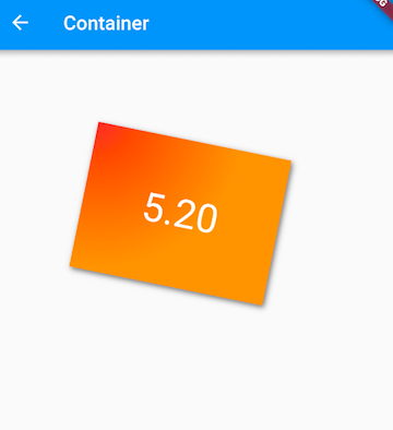
示例 1:
Container(
  margin: EdgeInsets.only(top: 50.0, left: 120.0),
  constraints: BoxConstraints.tightFor(width: 200.0, height: 150.0),//卡片大小
  decoration: BoxDecoration(  //背景装饰
    gradient: RadialGradient( //背景径向渐变
      colors: [Colors.red, Colors.orange],
      center: Alignment.topLeft,
      radius: .98,
    ),
    boxShadow: [
      //卡片阴影
      BoxShadow(
        color: Colors.black54,
        offset: Offset(2.0, 2.0),
        blurRadius: 4.0,
      )
    ],
  ),
  transform: Matrix4.rotationZ(.2),//卡片倾斜变换
  alignment: Alignment.center, //卡片内文字居中
  child: Text(
    //卡片文字
    "5.20", style: TextStyle(color: Colors.white, fontSize: 40.0),
  ),
 )
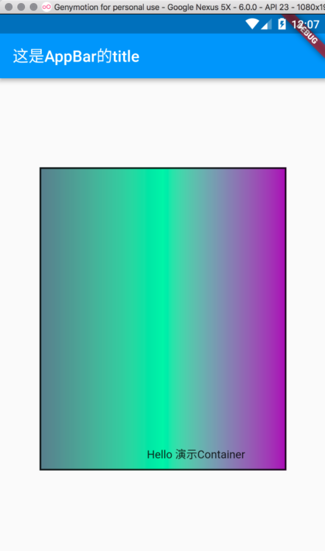
示例 2:
import 'package:flutter/material.dart';

void main() => runApp(MyApp());

class MyApp extends StatelessWidget {
  @override
  Widget build(BuildContext context) {
    return MaterialApp(
      title: '这是title',
      home: Scaffold(

        appBar: AppBar(
          title: Text("这是AppBar的title"),
        ),

        body: Center(
            child: Container(
              child: Text("Hello 演示Container"),
              alignment: Alignment.bottomRight,
              // Container中子控件的对齐方式
              width: 500,
              height: 380,
              // color: Colors.blueGrey, // 不能和decoration同时存在
              padding: EdgeInsets.fromLTRB(0, 0, 50, 10),
    //              const EdgeInsets.only(left: 0, top: 0, right: 10, bottom: 90),
              margin: EdgeInsets.all(50),
              decoration: BoxDecoration(
                  gradient: const LinearGradient(colors: [Colors.blueGrey, Colors.greenAccent, Colors.purple]),
                  border: Border.all(width: 2,color: Colors.black87),
              ),
        )
        ),
      ),
    );
  }
}
Clip 裁剪
Flutter 中提供了一些剪裁组件,用于对组件进行剪裁。
| 剪裁 Widget | 默认行为 |
|---|---|
| ClipOval | 子组件为正方形时剪裁成内贴圆形;为矩形时,剪裁成内贴椭圆 |
| ClipRRect | 将子组件剪裁为圆角矩形 |
| ClipRect | 默认剪裁掉子组件布局空间之外的绘制内容(溢出部分剪裁) |
| ClipPath | 按照自定义的路径剪裁 |
示例:
class ClipTestRoute extends StatelessWidget {
  const ClipTestRoute({super.key});

  @override
  Widget build(BuildContext context) {
    // 头像
    Widget avatar = Image.asset("images/logo.png", width: 100.0);
    return Center(
      child: Column(
        children: <Widget>[
          const Text('不裁剪'),
          avatar, //不剪裁
          const Text('裁剪为圆形'),
          ClipOval(child: avatar), //剪裁为圆形
          const Text('裁剪为圆角矩形'),
          ClipRRect(
            //剪裁为圆角矩形
            borderRadius: BorderRadius.circular(5.0),
            child: avatar,
          ),

          const Text('溢出部分裁剪'),
          Row(
            mainAxisAlignment: MainAxisAlignment.center,
            children: <Widget>[
              Align(
                alignment: Alignment.topLeft,
                widthFactor: .5, //宽度设为原来宽度一半,另一半会溢出
                child: avatar,
              ),
              const Text(
                "你好世界123456789",
                style: TextStyle(color: Colors.green),
              )
            ],
          ),
          Row(
            mainAxisAlignment: MainAxisAlignment.center,
            children: <Widget>[
              ClipRect(
                //将溢出部分剪裁
                child: Align(
                  alignment: Alignment.topLeft,
                  widthFactor: .5, //宽度设为原来宽度一半
                  child: avatar,
                ),
              ),
              const Text("你好世界123456789", style: TextStyle(color: Colors.green))
            ],
          ),
        ],
      ),
    );
  }
}
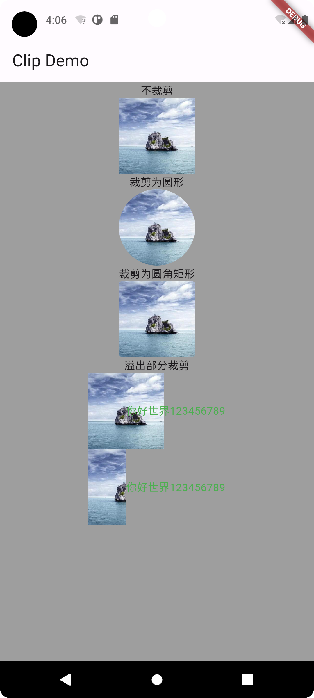
最后 2 个 Row,通过 Align 设置 widthFactor 为 0.5 后,图片的实际宽度等于 60×0.5,即原宽度一半,但此时图片溢出部分依然会显示,所以第一个 " 你好世界 123456789" 会和图片的另一部分重合,为了剪裁掉溢出部分,我们在第二个 Row 中通过 ClipRect 将溢出部分剪裁掉了。
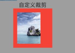
CustomClipper 自定义裁剪
剪裁子组件的特定区域
class MyClipper extends CustomClipper<Rect> {
  @override
  Rect getClip(Size size) {
    return const Rect.fromLTWH(10, 10, 60.0, 80.0);
  }

  @override
  bool shouldReclip(covariant CustomClipper<Rect> oldClipper) => false;
}
- getClip() 用于获取剪裁区域的接口,以原组件左上角为原点裁剪
- shouldReclip() 接口决定是否重新剪裁。如果在应用中,剪裁区域始终不会发生变化时应该返回 false,这样就不会触发重新剪裁,避免不必要的性能开销。如果剪裁区域会发生变化(比如在对剪裁区域执行一个动画),那么变化后应该返回 true 来重新执行剪裁
示例:
Widget avatar = Image.asset("images/logo.png", width: 100.0);
DecoratedBox(
  decoration: const BoxDecoration(color: Colors.red),
  child: ClipRect(
      clipper: MyClipper(), //使用自定义的clipper
      child: avatar),
);
ClipPath
ClipPath 可以按照自定义的路径实现剪裁,它需要自定义一个 CustomClipper<Path> 类型的 Clipper,定义方式和 MyClipper 类似,只不过 getClip 需要返回一个 Path
FittedBox 空间适配
案例:
Widget demoWidget() {
  return Column(
    children: [
      Padding(
        padding: const EdgeInsets.symmetric(vertical: 30.0),
        child: Row(children: [Text('xx' * 30)]), //文本长度超出 Row 的最大宽度会溢出
      ),
      Container(
        width: 50,
        height: 50,
        color: Colors.red,
        child: Container(width: 50, height: 50, color: Colors.green),
      ),
      const Padding(
        padding: EdgeInsets.symmetric(vertical: 5.0),
      ),
      wContainer(BoxFit.none),
      const Text('Wendux'),
      wContainer(BoxFit.contain),
      const Text('Flutter中国'),
    ],
  );
}

Widget wContainer(BoxFit boxFit) {
  return Container(
    width: 50,
    height: 50,
    color: Colors.red,
    child: FittedBox(
      fit: boxFit,
      // 子容器超过父容器大小
      child: Container(width: 60, height: 70, color: Colors.blue),
    ),
);
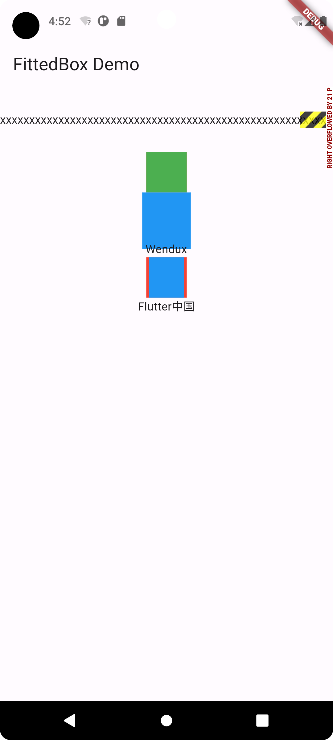
- 因为父 Container 要比子 Container 小,所以当没有指定任何适配方式时,子组件会按照其真实大小进行绘制,所以第一个蓝色区域会超出父组件的空间,因而看不到红色区域
- 第二个我们指定了适配方式为 BoxFit.contain,含义是按照子组件的比例缩放,尽可能多的占据父组件空间,因为子组件的长宽并不相同,所以按照比例缩放适配父组件后,父组件能显示一部分。
- Container 中有子组件的大小超过了自己,所以最终的效果就是绘制范围超出了 Container,但布局位置是正常的,所以就重叠了。如果我们不想让蓝色超出父组件布局范围,那么可以可以使用 ClipRect 对超出的部分剪裁掉即可
 ClipRect( // 将超出子组件布局范围的绘制内容剪裁掉
  child: Container(
    width: 50,
    height: 50,
    color: Colors.red,
    child: FittedBox(
      fit: boxFit,
      child: Container(width: 60, height: 70, color: Colors.blue),
    ),
  ),
);
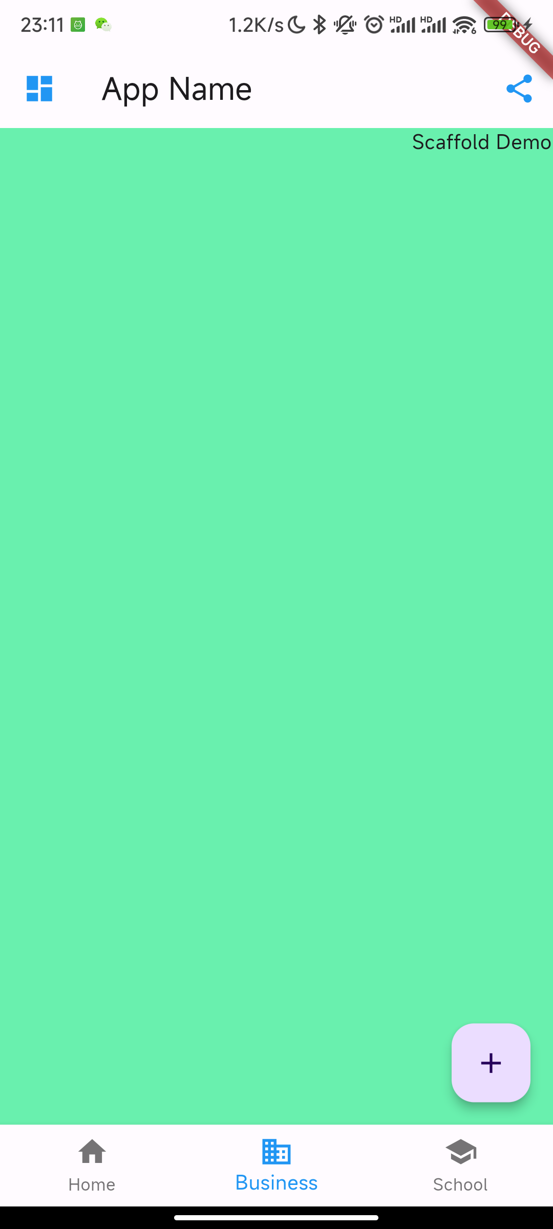
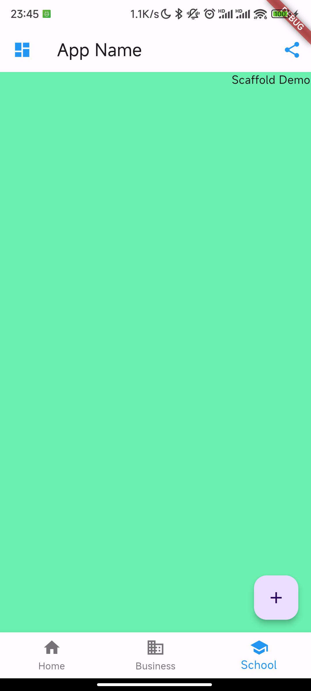
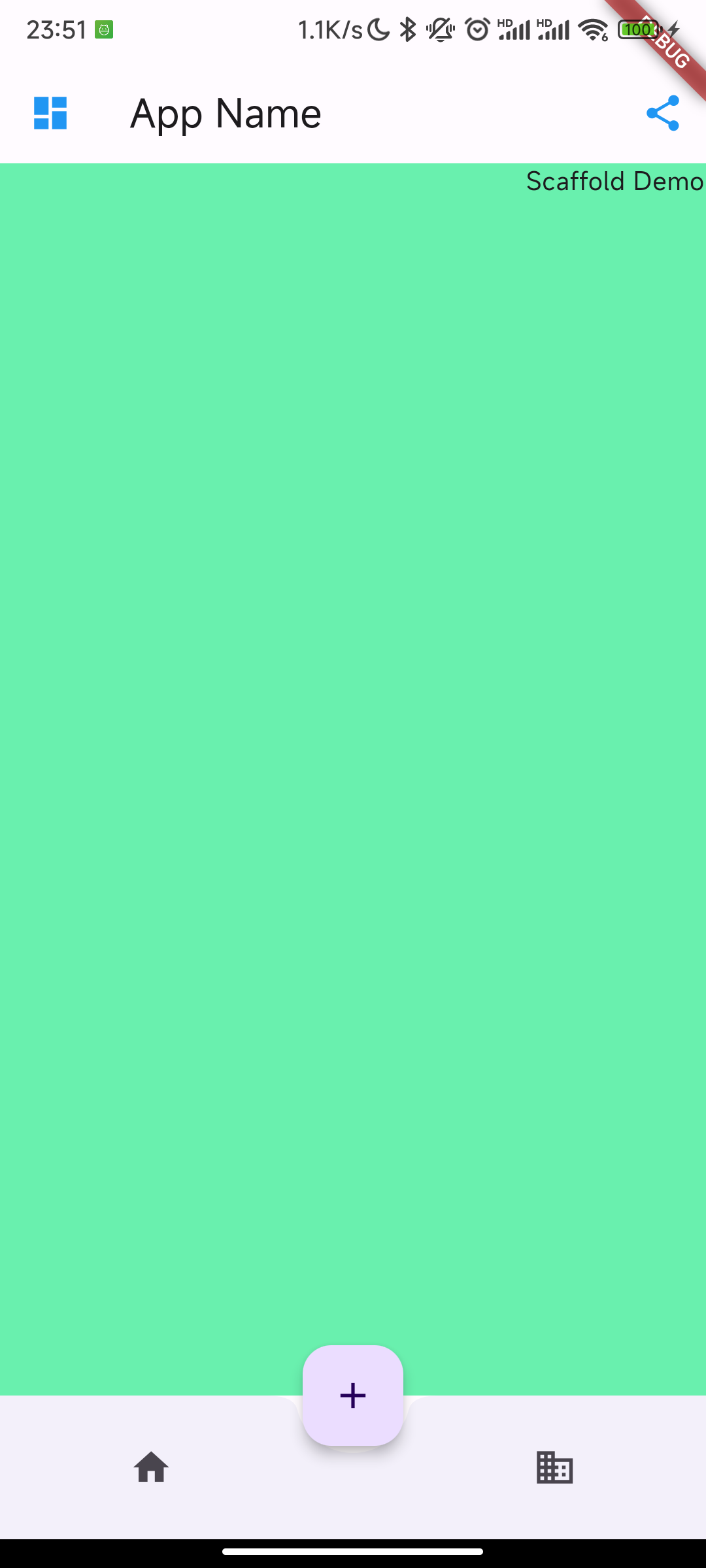
Scaffold 页面骨架
Scaffold 是一个路由页的骨架,我们使用它可以很容易地拼装出一个完整的页面。
Scaffold 定义:
Scaffold({
    super.key,
    this.appBar,
    this.body,
    this.floatingActionButton,
    this.floatingActionButtonLocation,
    this.floatingActionButtonAnimator,
    this.persistentFooterButtons,
    this.persistentFooterAlignment = AlignmentDirectional.centerEnd,
    this.drawer,
    this.onDrawerChanged,
    this.endDrawer,
    this.onEndDrawerChanged,
    this.bottomNavigationBar,
    this.bottomSheet,
    this.backgroundColor,
    this.resizeToAvoidBottomInset,
    this.primary = true,
    this.drawerDragStartBehavior = DragStartBehavior.start,
    this.extendBody = false,
    this.extendBodyBehindAppBar = false,
    this.drawerScrimColor,
    this.drawerEdgeDragWidth,
    this.drawerEnableOpenDragGesture = true,
    this.endDrawerEnableOpenDragGesture = true,
    this.restorationId,
})
- appBar 顶部的 title bar
- body 主体
- floatingActionButton 右下角悬浮按钮
- drawer 抽屉
- bottomNavigationBar 底部导航栏
注意:Scaffold 不能作为一个 Widget 的根 View,否则报错;
Scaffold widgets require a Directionality widget ancestor.
AppBar
AppBar 是一个 Material 风格的导航栏,通过它可以设置导航栏标题、导航栏菜单、导航栏底部的 Tab 标题等。
AppBar({
  Key? key,
  this.leading, //导航栏最左侧Widget,常见为抽屉菜单按钮或返回按钮。
  this.automaticallyImplyLeading = true, //如果leading为null,是否自动实现默认的leading按钮
  this.title,// 页面标题
  this.actions, // 导航栏右侧菜单
  this.bottom, // 导航栏底部菜单,通常为Tab按钮组
  this.elevation = 4.0, // 导航栏阴影
  this.centerTitle, //标题是否居中
  this.backgroundColor,
  // ...   //其他属性见源码注释
})
- Scaffold 添加了 drawer,默认情况下 Scaffold 会自动将 AppBar 的 leading 设置为菜单按钮

示例:
AppBar(
  title: const Text("App Name"),
  leading: Builder(builder: (context) {
    return IconButton(
      icon: const Icon(Icons.dashboard, color: Colors.blue), //自定义图标
      onPressed: () {
        // 打开抽屉菜单
        Scaffold.of(context).openDrawer();
      },
    );
  }),
  actions: <Widget>[
    //导航栏右侧菜单
    IconButton(
        icon: const Icon(
          Icons.share,
          color: Colors.blue,
        ),
        onPressed: () {}),
]);
打开抽屉菜单的方法在 ScaffoldState 中,通过
Scaffold.of(context)可以获取父级最近的 Scaffold 组件的 State 对象
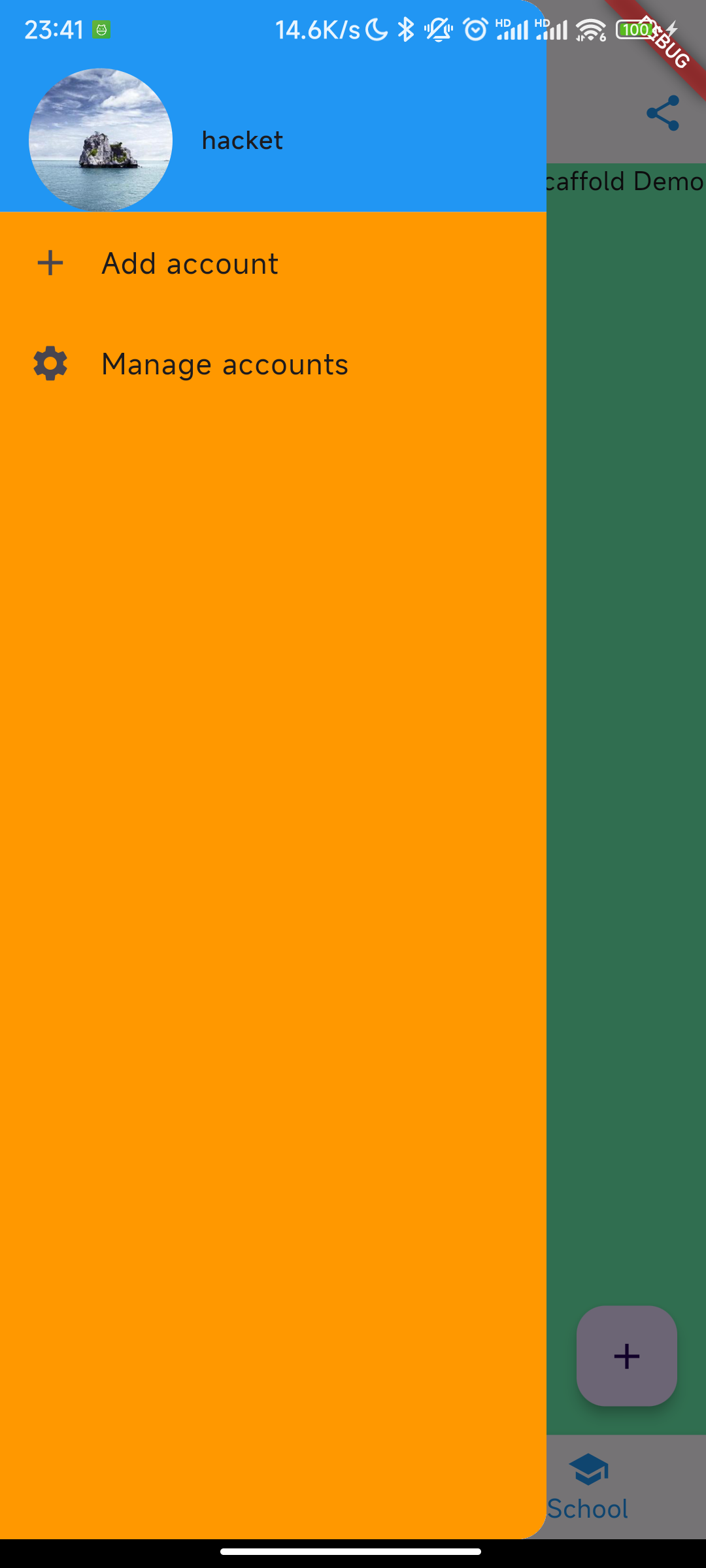
Drawer 抽屉菜单
Scaffold 的 drawer 和 endDrawer 属性可以分别接受一个 Widget 来作为页面的左、右抽屉菜单。如果开发者提供了抽屉菜单,那么当用户手指从屏幕左(或右)侧向里滑动时便可打开抽屉菜单。
class MyDrawer extends StatelessWidget {
  const MyDrawer({
    Key? key,
  }) : super(key: key);

  @override
  Widget build(BuildContext context) {
    return Drawer(
      child: MediaQuery.removePadding(
        context: context,
        // 移除抽屉菜单顶部和avatar默认留白
        removeTop: true,
        removeLeft: false,
        removeRight: false,
        removeBottom: false,
        child: Column(
          crossAxisAlignment: CrossAxisAlignment.start,
          children: <Widget>[
            avatar(),
            menuList(),
          ],
        ),
      ),
    );
  }

  Widget avatar() {
    return Container(
        decoration: const BoxDecoration(
          color: Colors.blue,
        ),
        child: Padding(
          // 用户信息
          padding: const EdgeInsets.only(top: 38.0),
          child: Row(
            children: <Widget>[
              Padding(
                padding: const EdgeInsets.symmetric(horizontal: 16.0),
                child: ClipOval(
                  child: Image.asset(
                    "images/logo.png",
                    width: 80,
                  ),
                ),
              ),
              const Text(
                "hacket",
                style: TextStyle(fontWeight: FontWeight.bold),
              )
            ],
          ),
        ));
  }

  Widget menuList() {
    return Expanded(
        // 菜单项目
        child: Container(
      decoration: const BoxDecoration(
        color: Colors.orange,
      ),
      child: ListView(
        children: const <Widget>[
          ListTile(
            leading: Icon(Icons.add),
            title: Text('Add account'),
          ),
          ListTile(
            leading: Icon(Icons.settings),
            title: Text('Manage accounts'),
          ),
        ],
      ),
    ));
  }
}
FloatingActionButton
FloatingActionButton 是 Material 设计规范中的一种特殊 Button,通常悬浮在页面的某一个位置作为某种常用动作的快捷入口,如本节示例中页面右下角的 "➕" 号按钮。我们可以通过 Scaffold 的 floatingActionButton 属性来设置一个 FloatingActionButton,同时通过 floatingActionButtonLocation 属性来指定其在页面中悬浮的位置
bottomNavigationBar
bottomNavigationBar 属性来设置底部导航
BottomNavigationBar
BottomNavigationBar(
    // 底部导航
    items: const <BottomNavigationBarItem>[
      BottomNavigationBarItem(icon: Icon(Icons.home), label: 'Home'),
      BottomNavigationBarItem(
          icon: Icon(Icons.business), label: 'Business'),
      BottomNavigationBarItem(icon: Icon(Icons.school), label: 'School'),
    ],
    currentIndex: _selectedIndex,
    fixedColor: Colors.blue,
    onTap: _onItemTapped,
)
- 打洞的位置取决于 floatingActionButtonLocation
- centerDocked 正中间
- endDocked 右边
- BottomAppBar 的 shape 属性决定洞的外形,CircularNotchedRectangle 实现了一个圆形的外形
BottomAppBar
bottomNavigationBar: bottomAppBar(),
floatingActionButtonLocation: FloatingActionButtonLocation.centerDocked,
floatingActionButton: FloatingActionButton(
    //悬浮按钮
    onPressed: _onAdd,
    //悬浮按钮
    child: const Icon(Icons.add))

Widget bottomAppBar() {
    return BottomAppBar(
      color: Colors.white,
      shape: const CircularNotchedRectangle(), // 底部导航栏打一个圆形的洞
      child: Row(
        mainAxisAlignment: MainAxisAlignment.spaceAround,
        children: [
          IconButton(icon: const Icon(Icons.home), onPressed: () {}),
          const SizedBox(), //中间位置空出
          IconButton(
            icon: const Icon(Icons.business),
            onPressed: () {},
          ),
        ], //均分底部导航栏横向空间
      ),
    );
}
Body 页面内容
body 属性,接收一个 Widget,我们可以传任意的 Widget。
可用 TabBarView,它是一个可以进行页面切换的组件,在多 Tab 的 App 中,一般都会将 TabBarView 作为 Scaffold 的 Body
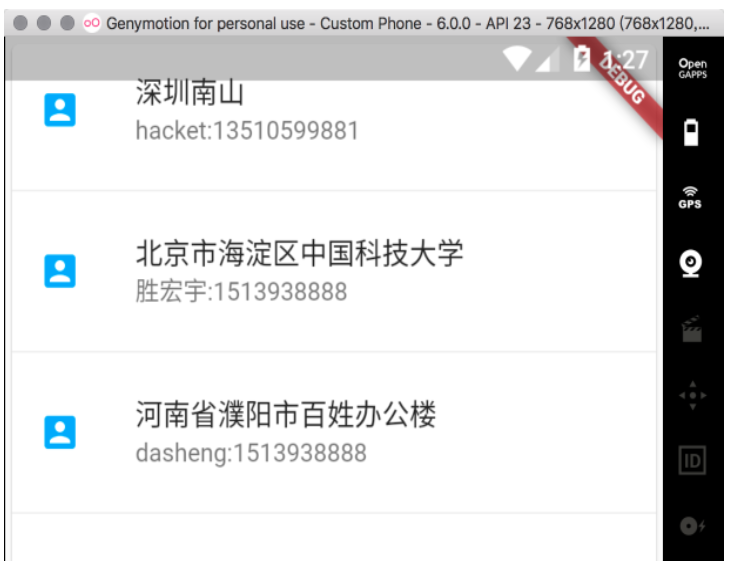
Card 卡片布局
卡片式布局。这种布局类似 ViewList,但是列表会以物理卡片的形态进行展示。
class MyCard extends StatelessWidget {
  @override
  Widget build(BuildContext context) {
    return Card(
      child: Column(
        children: <Widget>[
          ListTile(
            title: Text(
              '深圳南山',
              style: TextStyle(fontWeight: FontWeight.w500),
            ),
            subtitle: Text('hacket:13510599881'),
            leading: Icon(
              Icons.account_box,
              color: Colors.lightBlue,
            ),
          ),
          Divider(),
          ListTile(
            title: Text(
              '北京市海淀区中国科技大学',
              style: TextStyle(fontWeight: FontWeight.w500),
            ),
            subtitle: Text('胜宏宇:1513938888'),
            leading: Icon(
              Icons.account_box,
              color: Colors.lightBlue,
            ),
          ),
          Divider(),
          ListTile(
            title: Text(
              '河南省濮阳市百姓办公楼',
              style: TextStyle(fontWeight: FontWeight.w500),
            ),
            subtitle: Text('dasheng:1513938888'),
            leading: Icon(
              Icons.account_box,
              color: Colors.lightBlue,
            ),
          ),
          Divider(),
        ],
      ),
    );
  }
}
Flutter 间隔问题
设置 margin
Container 组件的 margin 属性
Container(
  margin: EdgeInsets.symmetric(horizontal: 30, vertical: 20),
  color: Colors.orange,
  width: 150,
  height: 150,
),
Container(
    color: Colors.orange,
    width: 150,
    height: 150,
)
设置了其中一个 Container 组件水平方向上的 margin 为 30,垂直方向上的 margin 为 20。效果如下: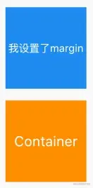
使用 Padding 组件
将 Container 组件放在 Padding 组件内,然后设置 Padding 组件的 padding 属性:
Container(
    color: Colors.blue,
    width: 150,
    height: 150,
),
Padding(
  padding: EdgeInsets.only(top: 20),
  child: Container(
    color: Colors.orange,
    width: 150,
    height: 150,
  ),
),
将第二个 Container 放在了 Padding 组件中,并设置了 Padding 组件的内上边距为 20。效果如下: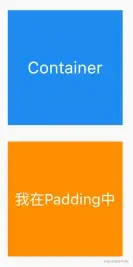
使用 SizeBox 组件
设置 SizeBox 组件的 height 属性或 width 属性:
Container(
  color: Colors.blue,
  width: 150,
  height: 150,
  child: Text(
    'data',
    style: TextStyle(fontSize: 16),
  ),
),
// 设置 SizeBox
SizedBox(height: 20),

Container(
    color: Colors.orange,
    width: 150,
    height: 150,
)
在两个 Container 组件之间添加 SizeBox 组件,然后设置 SizeBox 的 height 属性,从而让两个 Container 之间具有垂直方向上间距。效果如下: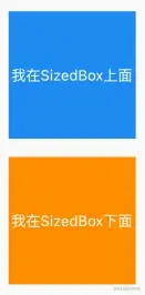
Row 子控件设置间距
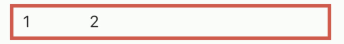
使用 SizedBox 保持固定间距
Row(
  children: <Widget>[
    Text("1"),
    SizedBox(width: 50), // 50宽度
    Text("2"),
  ],
)
使用 Spacer 填充尽可能大的空间
Row(
  children: <Widget>[
    Text("1"),
    Spacer(), // use Spacer
    Text("2"),
  ],
)
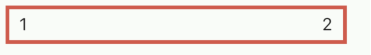
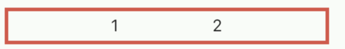
使用 mainAxisAlignment 对齐方式控制彼此间距
- spaceEvenly 平均分布
Row(
  mainAxisAlignment: MainAxisAlignment.spaceEvenly, //元素与空白互相间隔
  children: <Widget>[
    Text("1"),
    Text("2"),
  ],
)
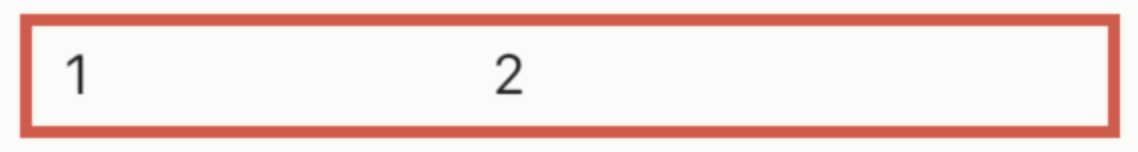
使用 Wrap
指定 spacing
Wrap(
  spacing: 100, // set spacing here
  children: <Widget>[
    Text("1"),
    Text("2"),
  ],
)
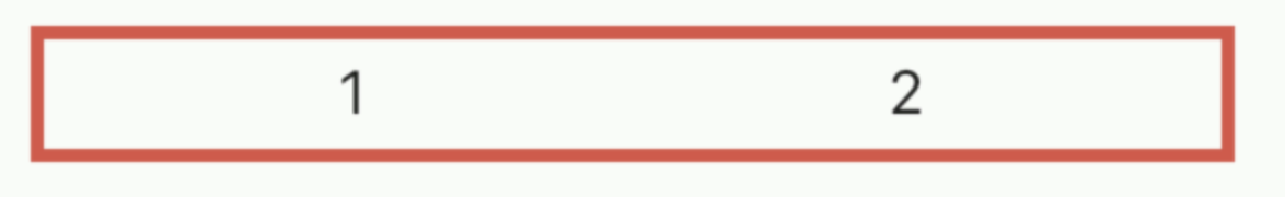
同样是使用 Wrap,设置 spaceAround
Wrap(
  alignment: WrapAlignment.spaceAround, // 空白包围住元素
  children: <Widget>[
    Text("1"),
    Text("2"),
  ],
)
设置子控件分别左对齐和右对齐
- 使用 spaceBetween 对齐方式
new Row(
  mainAxisAlignment: MainAxisAlignment.spaceBetween,
  children: [
    new Text("left"),
    new Text("right")
  ]
);
- 中间使用 Expanded 自动扩展
Row(
  children: <Widget>[
    FlutterLogo(),//左对齐
    Expanded(child: SizedBox()),//自动扩展挤压
    FlutterLogo(),//右对齐
  ],
);
- 使用 Spacer 自动填充
Row(
  children: <Widget>[
    FlutterLogo(),
    Spacer(),
    FlutterLogo(),
  ],
);
- 使用 Flexible
Row(
  children: <Widget>[
    FlutterLogo(),
    Flexible(fit: FlexFit.tight, child: SizedBox()),
    FlutterLogo(),
  ],
);